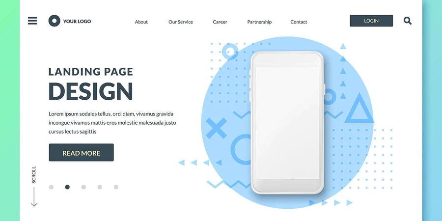
In today’s world, examples of minimalism in product design can be found all around us. As a design movement, minimalism is fairly new, coming to the fore in the late 1960s and early 1970s with the rise of American visual art and geometric abstraction in the lofts of New York. In brief, the philosophy is to express only the most essential elements of a product, brand, or subject by discarding any excessive or superfluous features.
The Crowning Reward of Art
Now it’s making a return, as user-friendliness comes back on the agenda for large multinational organizations and startups alike. Even minimalist packaging design has been trending in the last five years.
“Less is more” was the famous statement by architect Ludwig Mies van der Rohe, but we reckon some modern designers probably take this advice a bit too far. Another more considered view, this time from composer Frédéric Chopin, was that simplicity “emerges as the crowning reward of art.”
Minimalism versus Simplicity
These remarks lead us to a big UX myth: that minimalism and simplicity are synonymous. At Shark Design we agree that simplicity is key to the most compelling product and UX design achievements out there. However, simplicity (the reduction of complexity) is too often confused with minimalist style (the reduction of elements). In reality, the most simple-looking product UIs often conceal a hidden sophistication.
Attempts by the designer at reduction can unwittingly add more friction and extra cognitive load, creating a more confusing user experience. For example, icons without text labels are hard to understand, non-standard gestures are perplexing, the minimalist hamburger menu was shown many times to perform woefully. In other words, a keen attempt to be fashionably off-beat just for the sake of it can easily backfire.
2D Aesthetic
All designers should aspire to simplicity, but it’s good to avoid oversimplification in a misguided drive to conform to fads. Yes, minimalist app design is all the rage, but that’s because we can clearly see effective applications of the style online with, say, flat design (characterized by a 2D aesthetic in the user interfaces of sites and apps), and the tactile reality of Google’s Material Design, inspired by the fundamentals of ink and paper, which has expanded to all Google products, as well as WordPress and Chrome OS.
The 80-20 Rule
Another web design principle worth considering is called the ‘80-20 Rule.’ This means that when conceiving a website, you should expect 80% of the activity on the website to come from 20% of the page content. Focus on that 20% to get more sales conversions or subscribers. It’s time to test the purported benefits of minimalist design for yourself!
No matter your business objectives, make them the constant focus of your site. Don’t get the vital parts of your message muddled up with unnecessary information. Get rid of unneeded elements, pages, or social media widgets. If there is no purpose, remove it.
Shark Design will shape your website to fit your business and budget.

